Data Visualization
Biological sequence data and the computational analyses that explore it are complex. Efficient communication of the tangible conclusions that these analyses can draw is a necessary and important challenge. I pride myself on my figures and genuinely enjoy the process of making and editing them toward final drafts. I challenge myself to get as close as I can to final figures without using image editing software (e.g., Adobe Illustrator), relying on them for only the final touches. I generate the vast majority of my figures in R, usually with ggplot and related libraries, but am also familiar with python's matplotlib and ploty implementations.
For your viewing pleasure and to demonstrate my love for data visualization I have posted below some of my favorite figures that I have made over the years. Links to the code that generates each figure is provided, where possible - I'm still working to get some of these files cleaned-up.
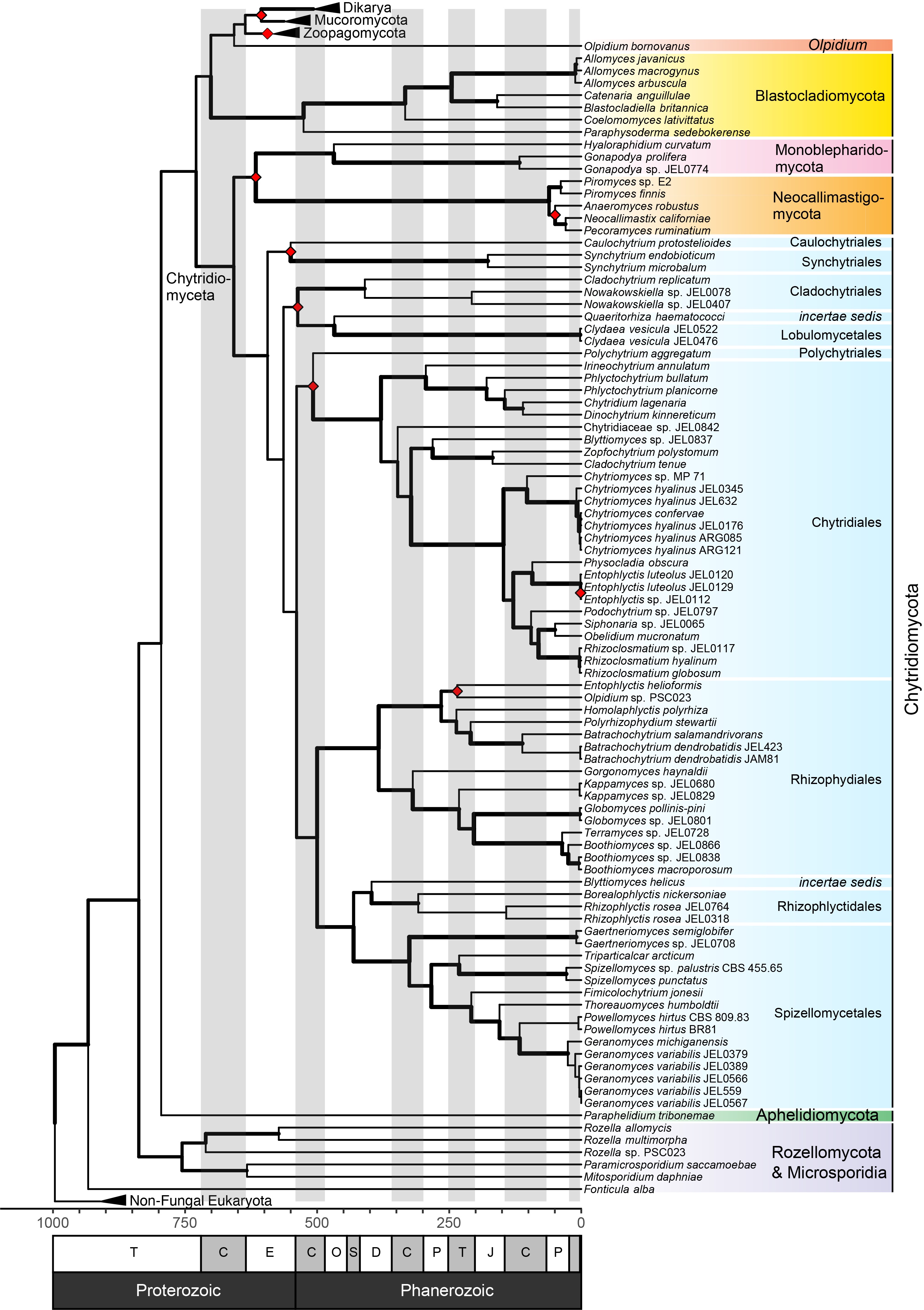
Figure 2 from Amses et al. 2022: Annotated, time-calibrated concatenated ML tree of kingdom Fungi, including 68 newly sequenced genomes of zoosporic fungi, based on 197,423 amino acid positions. All bootstrap support values are 100%; edge thickness indicates gCF support, and red diamonds indicate clades that were not present in ASTRAL tree. Blue shading are all taxa in the most species diverse phylum Chytridiomycota. Fossil-based calibration points were used to constrain minimum ages of the MRCA of several clades following Chang et al. (75): Blastocladiomycota = 407 Ma, Chytridiomycota = 407 Ma, Ascomycota = 407 Ma, Basidiomycota = 330 Ma, Mucorales = 315 Ma. A range of dates were used to constrain ages of the MRCA of Dikarya (500 to 650 Ma). The time scale in the chronogram is in millions of years before present with epochs abbreviated in the following order: T: Tonian, C: Cryogenian, E: Ediacaran, C: Cambrian, O: Ordovician, S: Silurian, D: Devonian, C: Carboniferous, P: Permian, T: Triassic, J: Jurassic, C: Cretaceous, P: Paleogene.
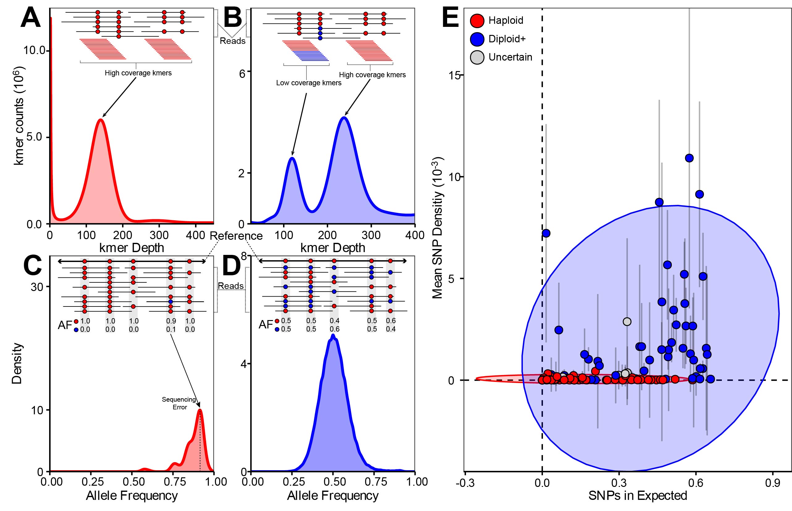
Figure 3 from Amses et al. 2022: Summary of ploidy inference for 112 assemblies and their underlying short reads. Curves (A–D) or points (E) are colored by ploidy state (diploid+: blue; haploid: red, uncertain: gray). (A) Histogram of k-mer counts (k = 23) generated from short-read data of Lobosporangium transversale CBS455.65 showing the unimodal distribution typical of read libraries derived from haploid genomes. Single peak corresponds to relatively high coverage k-mers alone and is approximately centered at mean sequencing depth. (B) Histogram of k-mer counts (k = 23) generated from short-read data of A. javanicus California 12 showing the bimodal distribution typical of read libraries derived from diploid genomes. Peaks respectively correspond to relatively high coverage k-mers that cover only homozygous positions and low-coverage k-mers that also cover heterozygous positions. Peaks are approximately centered at mean sequencing depth and 1/2 mean sequencing depth, respectively. (C) Canonical haploid AF histogram (from L. transversale) showing right-skewed unimodal distribution corresponding to SNPs introduced by sequencing error. (D) Canonical diploid AF histogram (from A. javanicus) showing unimodal distribution centered at 0.50 corresponding to SNPs introduced by heterozygous positions on homologous chromosomes. (E) Scatter plot of genomes by weighted mean of filtered SNP density across L50 contig set (y axis) and proportion of filtered SNPs from L50 contig set falling within 1 SD of the mean of each genome’s theoretical binomial distribution (x axis). Ellipses are normal ellipses around diploid+- or haploid-annotated points. Error bars represent SD. Dashed lines indicate the origin.
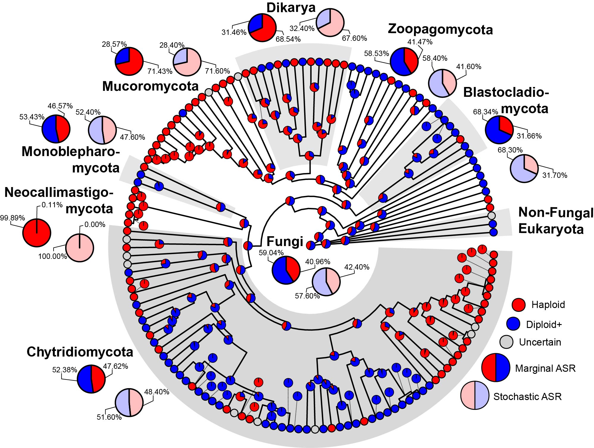
Figure 4 from Amses et al. 2022: Best concatenated ML tree annotated with inferred ploidy. Tips are colored according to the ploidy of each genome they represent (red: haploid, blue: diploid, gray: uncertain). Pie charts on internal nodes represent ancestral state probabilities inferred from marginal ancestral state reconstruction of ploidy status across Fungi. Major clades are labeled with bold text and alternating gray–white insets. Major clades are further annotated with the enlarged pie charts that show the ancestral state probabilities of their ploidy status inferred via marginal ancestral state reconstruction (solid, and present on tree edge) or stochastic ancestral state reconstruction (transparent, and absent on tree edge).